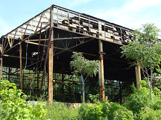
This is the former home of Kroger's, robbed at gunpoint in 1959 by none other than James Earl Ray.
A Blog detailing the beauty of St. Louis architecture and the buildup of residue-or character-that accumulates over the course of time.
Saturday, June 30, 2012
Friday, June 29, 2012
Old Army Munitions Plant

Not much has been happening to the old Army Munitions Plant since it was demolished several years ago.

Apparently the site was polluted, but it sits amidst a large group of warehouses and other industrial use facilities.

Other than illegal dumping, not much else is happening here.

Thursday, June 28, 2012
Abandoned Factory, Walnut Park #2
Wednesday, June 27, 2012
Abandoned Factory, Walnut Park #1

Situated on a quiet backstreet near West Florissant Avenue, the Barry-Wehmiller Machinery Co. sits in a state of increasing ruin.

Later taken over in the 1990's by a wholesale industrial product resale concern, it now sits abandoned, and filled with "stuff."

See an article here about the interior of the factory.

Owned by the City's Land Reutilization Authority, it most likely is polluted and hazardous for use. One can only imagine in 1912, when the factory opened, the sounds of boots on the streets as workers walked down the street from their homes in Walnut Park.

Tuesday, June 26, 2012
The Horseshoe, Completely Gone

I had the opportunity to get a ride up to the infamous Horseshoe, a section of one way street that loops around a desolate corner of Wells-Goodfellow.

I asked one of my students, a St. Louis police officer, about the area, and he informed me that he actually grew up on the Horseshoe, and its terrible, violent reputation was well deserved.

Sadly, what a developer had thought would be a perfect neighborhood where children could play in the streets without fear of vehicular traffic became a recipe for another kind of traffic. Since the street was one way, the police had to enter at the top of the Horseshoe, providing plenty of time for drug dealers on the lower half of the loop to be warned of their approach by their confederates.

The official explanation for the Horseshoe's demolition was that it was in a flood plain and the land was needed for MSD's use as a retention pond.

Maybe so, but I can't help but think it worked out well that Wells-Goodfellow was finally rid of this street.

It's so sad to see what was clearly a beautiful quiet oasis in the city to come to this. Every house is gone now.
 Watch a sensationalized show about the area.
Monday, June 25, 2012
Yes, You Can Force CVS to Do What You Want

I have been following the proposed demolition of the AAA Club on Lindell for a while now, but Vanishing St. Louis says it best here. While honestly, it's not the most urban building in the world, the AAA building is WAY better than the crap that the CVS chain builds. And speaking of them, despite what they claim, they can make buildings that respond to local tastes and context. This CVS, at the intersection of Henry and Clayton Roads, was forced to be a little more stylish than the average CVS. So yes, they will do it if you make them.

Honestly, I think the Preservation Board is a complete joke, more proficient at forcing small home owners to do their bidding than forcing major local power brokers to do what is right. I'll never forget the meeting where I saw the Board fine a private citizen for two freaking windows that weren't perfect enough for their tastes, while later on in the meeting they rolled over for a powerful local entity who shall remain anonymous. Basically, if the mayor's office or alderman wants the building saved, it will be, and if not, it's toast.

Heck, even Walgreen's tries a little bit harder if forced, as this store at Clayton and Clarkson Roads attests. Do I think these two stores I just showed are the pinnacles of Western architecture? Of course not, but they're slightly better than the average, ugly stores the two chains build.
Sunday, June 24, 2012
3719 Texas Flounder
Friday, June 22, 2012
Nelson Atkins Museum, Interior of New Addition
 I was greatly impressed how the Henry Bloch addition sensitively complements the older Nelson-Atkins building.
It might be cliche, but it really is a symphony of curves and angles that harmonize together.

I was left wanting to just explore the new wing, walking up and down the long ramps and staircases.

The contemporary art shown in the new wing looks great in its complementary surroundings.

Modern architecture can reconcile with the classical art of the past.

Thursday, June 21, 2012
Nelson-Atkins Museum, Kansas City, Missouri, Interior
Wednesday, June 20, 2012
Nelson-Atkins Museum of Art, Kansas City, Missouri

I like the Nelson Atkins building a lot; it's from that period where Neoclassical architecture in America became much more serious, severe and more modern.

Anchored by the standard four colonnades on each front, it recently saw a massive expansion project that we will look at later.

Bas-relief panels illustrate what is presumably the history of Kansas City.

The original smokestack and shuttlecock make an interesting pair of opposites.

Tuesday, June 19, 2012
Kauffman Center for the Arts, Kansas City, Missouri, Interior
Subscribe to:
Posts (Atom)
A Blog detailing the beauty of St. Louis architecture and the buildup of residue-or character-that accumulates over the course of time.


